")
")
Formatting
Map & projection
Map
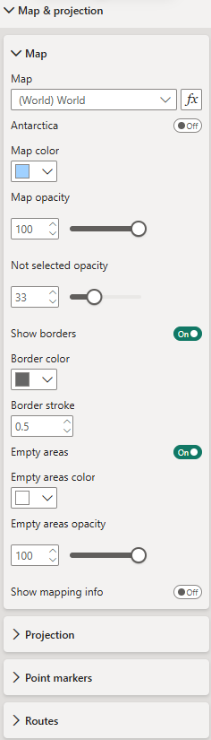 Map - Choose from over 200 maps (e.g., world, continents, individual countries with their administrative areas) to visualize your data. To use maps other than the default World map is a premium feature and you need to have a Maps premium license.
Map formatting - Define map color, opacity, and borders.
Empty areas - Toggle to display areas/shapes without data mapped to them.
Mapping info for unmapped areas - Toggle to show available mapping attributes to support data preparation and mapping.
Projection
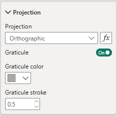 Projection type - Choose from the projections available for the selected map. The options vary depending on the map selection.
Graticule settings - Only when using the orthographic projection, you have the option to display a graticule. If you opt to show it, define its color and stroke width (in pixels) here.
Point markers
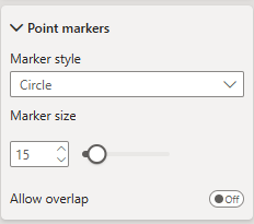 Point markers - If your data (locations) includes point coordinates, you can define the marker format here, i.e., marker style (circle, square, diamond) and marker size (in pixels).
Allow overlap - When enabled, all markers are displayed on the map, even if they overlap. When disabled, overlapping markers are hidden to maintain a clear and uncluttered view.
Routes
 Routes - If your dataset contains lines or routes, you can configure their appearance here.
Line style - Choose between solid, dashed, or dotted lines.
Smoothing - Enable to smooth line curves; disable for straight segments.
Line width (pixels) - Sets the default stroke thickness of the lines.
Opacity - Controls the transparency of the lines.
Arrow style - Optionally add arrows at the start, end, or both ends of a line.
Arrow size - Defines the size of the arrows.
Routes on top - Toggle to render routes above minicharts; when disabled, charts are displayed on top.
Interaction
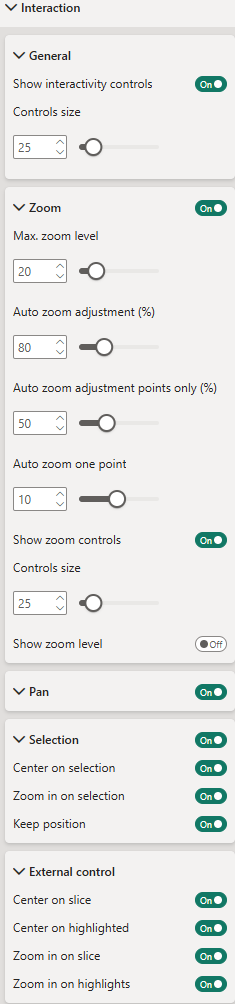 General
Show interactivity controls - Toggle to display interactive buttons directly on the visualization for convenient control of interaction settings. The buttons appear on the left side of the visual. For details on each button, see Interactivity controls. (Premium feature)
Controls size - Set the size of the interactivity buttons.
Zoom
Enable or disable zoom functionality on the visualization.
Max. zoom level - Define the maximum zoom level.
Auto zoom adjustment (%) - Adjust the auto-zoom to leave extra space around zoomed elements. For example, 80% means auto-zoom will only zoom to 80% of the automatically determined level.
Auto zoom adjustment points only (%) - Same as above, but applies specifically when only points are selected.
Auto zoom one point - Define the zoom level when a single point is selected or filtered. Since points have no size, a default zoom factor must be specified.
Show zoom controls - Toggle to display zoom buttons on the right side of the visual. If disabled, zooming is available via your device’s default method (e.g., mouse wheel, two-finger gesture).
Controls size - Set the size of the zoom control buttons.
Show zoom level - Toggle to display the current zoom level on the visualization.
Pan
Toggle to enable visual panning via drag.
Selection
Enable selection functionality within the visualization. Hold Ctrl (or your system’s equivalent meta key) to select multiple elements.
Center on selection - Automatically center the visualization on the last selected element.
Zoom in on selection - Automatically zoom in on selected elements.
Keep position - Keep the centered on position after de-selection.
Center on slice - Automatically center the visualization on filtered elements. (Premium feature)
Center on highlighted - Automatically center the visualization on highlighted elements. (Premium feature)
Zoom in on slice - Automatically zoom in on filtered elements. (Premium feature)ature.
Zoom in on highlights - Automatically zoom in on highlighted elements. (Premium feature)
Interactivity controls


Labels
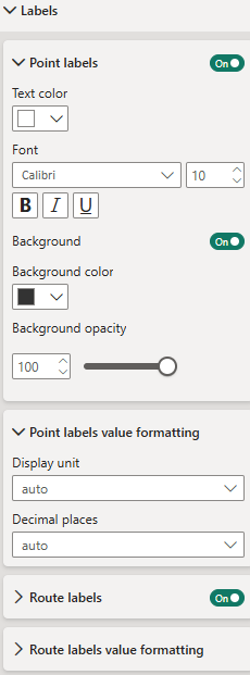
Labels can be displayed on all map elements (areas/shapes, points, and routes). They can be formatted individually for each element type.
Shape labels - Define formatting for labels on areas/shapes: color, font, background, and background opacity.
Shapes value formatting - Value formatting (display unit and decimal places) to be applied when the measure "Label value" is numeric.
Point labels - Define formatting for labels on point elements. Formatting options are equivalent to those of shape labels.
Route labels - Define formatting for labels on route elements. Formatting options are equivalent to those of shape labels.
Charts
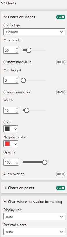
Charts can be displayed on areas/shapes and points on the map. Currently, there are no charts for lines/routes. Instead, for lines/routes, the line width can be controlled by the "Chart/size value" measure.
Charts can be formatted individually for areas/shapes and point elements. The formatting options are the same.
Chart type - Choose between Column, Circle, and Bubble charts. A Column chart displays a column on each shape/area or point, with column heights representing the absolute value of the assigned "Chart/size value" measure. A Circle chart displays a circle on each chart element, with the size of the circle representing the "Chart/size value" measure. A Bubble chart displays a circle that contains the label text, with the size of the bubble representing the "Chart/size value" measure.
Chart max height or chart max radius - Maximum height (for column charts) or radius (for circle charts). Chart heights or radii will be scaled according to the "Chart/size value" measure, ranging from 0 to the maximum height/radius.
Chart colors - All charts showing positive values will have the same color. You can use color as an indicator by setting a different color for negative values.
Allow overlap - When enabled, all charts are displayed on the map, even if they overlap. When disabled, overlapping charts are hidden to maintain a clear and uncluttered view.
Chart value formatting - Value formatting (display unit and decimal places) to be applied when the measure "Chart value" is numeric. It will be applied when showing the "Chart value" measure in the tooltip.
Routes
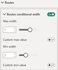 Routes conditional width - When toggled, lines/routes' width will represent the value assigned to the "Chart/size" measure.
Max width - Width of the line/route with the highest absolute value in "Chart/size" measure.
Custom max value - You can set a custom max value here.
Min width - Width of the line/route with the lowest absolute value in "Chart/size" measure.
Custom min value - You can set a custom min value here.
Colors
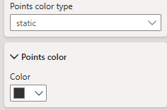
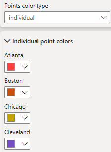
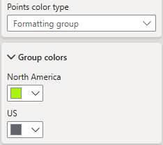
Color types
There four "Color types" that define the basis of coloration: static, individual, formatting group and value. They can be individually selected for each element type (area/shape, point and line).
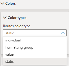
Depending on the color type selection the according formatting options will appear.
Color type "static"
Same static color for all elements of an element type
Color type "individual"
Individual color for each single element
Color type "formatting group"
Individual color for each formatting group. Elements will inherit color from their formatting group (see Formatting groups).
Color type "value"
Value based coloration (based on measure "Color value")
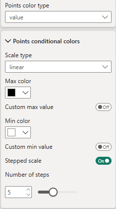 Scale type - Choose from three different scales: linear, diverging and logarithmic.
Stepped scale - Enable to create a stepped scale. Otherwise scale is continous.
Number of steps - Define number of steps for stepped scale.
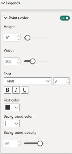
Legends
Formatting of color legends for value based coloration
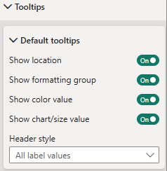
Tooltips
Tooltip settings
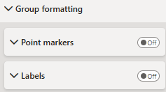
Group Formatting
Formatting group based formatting., available for point markers and labels
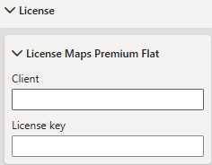
License
License settings for Maps Premium Flat subscription